
Wednesday, 31 December 2014
Tuesday, 16 December 2014


Monday, 15 December 2014
Sunday, 14 December 2014
Saturday, 13 December 2014

Friday, 12 December 2014
Equipment Software List
Equipment I can use
- Apple Mac
- Tripod
- Camera
- Photoshop
- Indesign


Thursday, 11 December 2014
SLR Test Shots
Medium Shots and Close-ups


The first types of shots I did were mid-shots. I did mostly these shots because I plan on taking a mid-shot of my model as that is the type of shot that is on most magazines.
I found that experimenting with mid-shots can be quite difficult as it is hard to get the camera to focus on what you want it to focus on. However, in the end I succeeded but when I next take some model test shots I will try and take more professional photographs with a suitable background.

The next type of shots I tested with were close-ups. I tested with close-ups as I have seen magazines with close-up shots and I am debating on whether this will look good on my front cover.
I found that experimenting with close-ups was an easier process as its easier for the camera to tell what your focusing on. Even though I did succeed at close-up shots, I am still unsure as to whether I will be doing close-ups on my magazine cover.


Wednesday, 10 December 2014
Double page spread Research
Research for my Double page spread
 I have researched different double-page spreads from different magazines such as XXL, Vibe, Billboard and Rolling Stones. This is 5 examples of magazines that I will use to help me create my double-page spread.
 Most of the photographs are on the left side of the page with backgrounds therefore I am considering using this layout. I will keep the photograph to a black and white theme.
In the background of my model for the double-page spread may be a brick wall or I may photoshop the background.
 Although most of the titles are at the top, I do like how on the second one it has a letter through the middle to represent her name "Lady Gaga". Therefore I am considering this process however I may just do a traditional title.
As I am doing my magazine black and white, I am either going to included red or navy blue therefore this will feature on my double page spread.
 As I am doing my magazine black and white, I am either going to included red or navy blue therefore this will feature on my double page spread.
All of the texts are laid out in the same way as they all go to one side and go straight through the middle therefore I will do this to keep my magazine looking professional. I will use a serif font for my article as this makes it easier for the public to read
 On the second one I like how there is a top line with the artists name on the end, therefore I am going to include this in my double page spread. However, I am not sure that the writing on the top line will be the artists name.
On the last double page spread, I like how they have kept to a colour scheme therefore I plan on doing this.
Monday, 8 December 2014
Social Media Sites

For my magazine, my target audience is going to consist of male and female young and older teens. Considering this as my target audience means they will be interested in the popular social media sites of Facebook, Twitter and Instagram. This means that to get to my target audience I can use these social media sites and produce feedback for my magazine to see what my target audience like about my magazine and what they dislike. This will help me to produce the kind of improvements I need to aim for my target grade.
Sunday, 7 December 2014
Sound
Sound Terms and Definition
Synchronous sound and Non-digetic sound - When the sound matches the visual image we see.
Asynchronous sound and Digetic sound - Sound effects that are not matched with a visible source on screen but are still within the story world.
Sound Terminology - Sound effects, sound motif and sound bridge.
Sound Effects - Sound that is added for effect (e.g. in a horror movie they would add scary music in the background that builds up the tension).
Sound Bridge - This is when the scene begins with the carry-over sound from the previous scene before the new sound begins.
Sound Motif - A sound effect or a combination of sound effects that are associated with a particular character, setting, situation or idea through the film.
Dialogue - The transmitter of story information; this is usually recorded and reproduced for maximum clarity.
Voice-over - A piece of narration in a film or broadcast; not accompanied by an image of the speaker.
Direct Address/Sound - Issues from the source itself, such as those frequencies coming from an actors mouth.
Sound Perspective - This refers to the apparent distance of a sound.
Score - Music composed, arranged and played specifically for the production.
Incidental Music - Non-digetic music that accompanies events or changes of scenes.
Theme - Music that always accompanies a particular programme or a particular character and suits its moods or themes.
Stings - These are short bursts of music.
Ambient Sound - This can be recorded on location or can be added to the soundtrack. It is sound that is appropriate for the scene.

Saturday, 6 December 2014
AS Media Music Magazine Questionnaire 3
Analysis
The first question I asked was "Do you think 'Drive' is an appropriate name for my R&B magazine? If not, then what do you think?". She said that she think it is a good name and her facial expression made me believe this therefore I am going to call it Drive. The second question I asked was "As I am doing an R&B magazine, I want to do my magazine black and white, and include either red, navy blue or both. What do you think?". She believed that only red should be included and not navy blue as did another person therefore I am considering this concept. The next question I asked was "If I was to call my magazine 'Drive', then do you think a good positioning statement would be 'Riding with the beats'?". Although she said yes, she didn't seem very keep on this slogan therefore I am re-considering whether to use this or not. The final question I asked was "I want to make my magazine popular within the UK an USA as I want it to be a popular worldwide R&B magazine, therefore should I release it monthly?" She said yes I should and she seemed to very much agree with this idea therefore I will make it a monthly magazine.
AS Media Music Magazine Questionnaire 2
Analysis
The first question I asked was "Do you think 'Drive' is an appropriate name for my R&B magazine? If not, then what do you think?" She said yes with much enthusiasm, therefore I will be naming my R&B magazine Drive.The second question I asked was "As I am doing an R&B magazine, I want to do my magazine black and white, and include either red, navy blue or both. What do you think?" She believed that I should stick to the 3-colour-rule and that red would be best for this therefore I am going to take this into consideration. The next question I asked was "If I was to call my magazine Drive, then do you think a good positioning statement would be 'Riding with the beats'?". She said yes, however I don't think that she was totally keen on it therefore I may consider something else. The final question I asked was "I want my magazine popular within the UK and USA as I want it to be a popular worldwide R&B magazine, therefore should I release it monthly?" She said yes, therefor I plan on making it a mothly magazine.
AS Media Music Magazine Questionnaire 1
Analysis
The first question I asked was "Do you think 'Drive' is an appropriate name for my R&B magazine? If not the what do you think?". She said it is good, I also followed this survey up on my twitter account and drive was most popular therefore I am going to name my magazine Drive. The second question I asked was "As I am doing an R&B magazine, I want to do my magazine black and white, and include wither red, navy blue or both. What do you think?" She said I should include both which I am considering on doing so. The next question I asked was "If I was to call my magazine 'Drive', then do you think a god positioning statement would be 'Riding with the beats'?" She said yes in a satisfying manor therefore I am considering it as it fits well with the title. The final question I asked her was "I want to make my magazine popular within the UK and USA as I want it to be a popular worldwide R&B magazine, therefore should I release it monthly?". She agreed with the question therefore I am going to release it monthly.
Friday, 21 November 2014

Monday, 17 November 2014
Questionnaire Results
Poll Junkie Results
I produced a Questionnaire on polljunkie.com and asked a couple of questions about my R&B magazine to get a public view on what people would like to see my magazine. These are my final results and this is what I'll be taking forward into the making of my magazine. Drive is my final decision for the name of my magazine. The majority of people voted for both red and navy blue to be included, I will defiantly use red but I am unsure about the navy blue however I will experiment with it when making my magazine. My magazine is going to be a monthly issue that will cost £4.00. Although my positioning statement was going to be 'Riding with the beats', I thought of a new one at the last minute which is 'Ride and Rhythm', therefore this is what I have decided to use.


Sunday, 16 November 2014
Tuesday, 11 November 2014
Social Questionnaires


Audience Response
As the majority of this generation is on social media, I decided to ask Twitter what name I should use for my R&B magazine. I choose twitter as twitter is a very popular social media site. 6 people said "Drive", 4 people said "Criminal", and no one said "Strong". Therefore I have picked Drive to be the title of my R&B magazine. I found this experiment to be successful as it connects with todays society and gives me an insight on what they would want.


Wednesday, 5 November 2014
Shot Type Reseach

Different types of Camera Shots
This shot would be a long shot and it focuses on the building which is far away. I would only use a long shot in my music magazine if I was to do a background and in the background would be a long shot of something. However, I am not to sure on what background I plan on doing.

This shot is a medium shot because it is taken from the waist up. I am so far planning to use this shot in my magazine for when I take a photograph of the person who will be my main image on my music magazine. I am planning on using this shot as a majority of magazines use a medium shot on the cover.

This shot is of a close-up. I am considering to use this shot on the cover of my music magazine for my main image as I have looked at quite a few magazines that have used a close-up on the front cover and I feel it looks really effective. However, it may be a difficult task to use a close-up as it may be hard to work around it with the title and articles.
Tuesday, 4 November 2014
Music Mastheads

Music Magazine Mastheads
Here I have created different mastheads with different fonts and different names. I have created these to help me decide on which I will be using for my R&B magazine.
I have used a messy kind of font for the first one as I looked at R&B magazines and they were all kind of this shape however I have added a twist with the messiness. I have called it 'Criminal' because most people label R&B artists with crimes so I am going to express that within the magazine. It could also be called criminal because of the fact that you can consider crime as something you are drawn into and maybe addicted to therefore you can re-inisuate that into R&B and say you are drawn into the music and you are addicted. To improve it I would maybe space the letter out more.
For the second one, I have used a square-shaped kind of font. I am not to sure on this font however I may experiment with it further and see how it goes. I decided to use the name 'pride' to show that the R&B artists have pride within themselves from how hard they worked and to show that there is pride in R&B music. To improve it I would maybe add an effect to the font.
The next font I have used is one that I am quite fond of, you can not see the detail within the font but it has white bits at the bottom of it. I do like the nam 'stereotype' as most R&B artists are labelled and stereotyped as criminals and 'thugs' therefore it would be a good name for an R&B magazine. To improve it I would make sure the detail stands out more.
For the final font, I used a quite block like font. I do like this font however I am not sure that it would fit with the theme of R&B. I used the title 'frequency' because it describes different numbers of occurrences, therefore I could call it frequency due to the difference of this genre compared to overs. However, I am not keen on this name. To improve it I would give it a different name and make the font suit the genre more.
Within these mastheads I am still unsure on the font and name I will use but it may not be either of these. However I will continue to experiment and see what fonts and names for my R&B magazine that I come up with.
Monday, 3 November 2014
Magazine Analysis 2

Magazine Analysis
I am analysing the music magazine "Rolling Stones". The layout of this magazine follows the codes and conventions of a magazine. The denotation of this magazine is the masthead 'Rolling Stones', the Headline 'Neil Patrick Harris', the kicker 'The dark days behind their best album yet', the Menu strip of all the artists names and they feature article photo f Neil Patrick Harris.The title of the magazine is in red which has connotations of romance, love, and sexual references which fits with the feature article photo as he is naked with just a hat and bow. Neil is being presented as provocative as he is naked. The background of the magazine is white which also has connotations of sexual references, love and romance as white is a colour linked to weddings. The colour black also has connotations of being a sexual colour therefore all the colours fit with the theme of this front cover which is to be a sexual magazine cover.
The primary target audience for this magazine would be females of ages 15-23 as Neil on the front is half-naked which creates an attraction for girls. The secondary target audience would be fans of the magazine 'Rolling stones' as it is a very famous music magazine or it could be fans of the TV show "How I met your mother" as he is one of the stars in this show.
It appeals to the primary target audience of females as he is an attractive male who is naked with just a hat and bow and he is surrounded by the colours of sexual references therefore it appeals even more for the audience. It would appeal to fans of "How I met your mother" as one of the quotes are "How he met himself" which could also be there motivation to buy it. A motivation for music magazine lovers to buy this magazine would be the list of famous singers down the side.
Magazine Analysis
Magazine Analysis
I am analysing the music magazine "Billboard". The layout of my front cover follows the codes and conventions of a magazine. The denotations of this magazine are the Mast Head (Billboard) which is placed down the side of the page in white writing, the feature article photo (Chris Brown) who is placed largely in the middle, a Selling Line (Quote) which gives a sneak peak of what is inside the magazine, and at the bottom of the magazine there is also another Selling Line.

The background of the magazine is green and the artist also wears a green jacket. The colour green has connotations of money and wealth which represents the artist as he is a wealthy man because of his job as a musician. The background could also be green to represent the money that this magazine makes as it is a popular music magazine. The artist also wears a gold chain which has connotations again of wealth, success and money. This music magazine reveals his tattoos and has the quote 'Maybe I was out of control' which to an audience can represent him as a bad person as tattoos have connotations of crime and the word 'Out of Control' shows him as a crazed and bad man. The artist expressions seems to be asking for forgiveness as he is opening up his shirt, only showing his chest which is directly where his heart his, and his facial expression suggests sorrow.
The primary audience would be young girls aged (15-25) and young boys aged (15-23) as the magazine billboard would be bought by an older set of teens audience rather than younger teens and Chris Brown is an artist with both male and female fans so his audience would be interested in the magazine aswell. The secondary target audience would be parents, as they would buy this magazine for their child maybe because they're a Chris Brown fan or maybe because they like this magazine.
It appeals to the target audience because Chris Brown is the main image and he is placed in the middle very largely. It will appeal to females as his shirt is undone which can represent a sexual approach and females will be attracted to this. It also appeals to males as he represents wealth and riches by wearing a green blazer and a gold chain therefore he is a role model for males.
The motivation to buy this magazine would be the quote "Maybe I was out of control" as they have wrote it in a big font so it straight away attracts the attention of the customer and the customer will be interested in knowing what the article is about therefore they will buy it.
Saturday, 1 November 2014
Music Magazine Collage
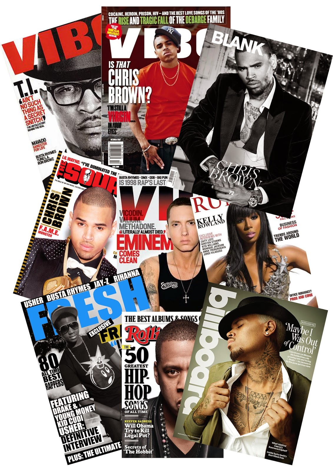
Music Magazines
I have made a collage of R&B music magazines. The magazines in this collage that I have included are Vibe, Billboard, Runway, Fresh, The Source and Rolling Stones.
The reason I have decided to do an R&B magazine is because my favourite musician is Chris Brown and most of his music is R&B therefore doing an R&B magazine will be best as that is the genre of music I listen to the most and I will have a better understanding of.
All the magazines include R&B artists as the main image therefore so will mine. The majority of the magazines are red, black and white therefore I may decide to do mine them colours to follow an R&B music magazine or I may decide to do them different colours so mine can be a unique R&B magazine.
When making my music magazine, the artist on the cover of my magazine may be Chris Brown as he is the reason I have decided to do an R&B magazine and he is also a popular artist. Having a popular artist on the cover of the magazine is important for the music magazine to sell. However, if I do decide to do my own photography for higher marks then I will use Chris Brown as part of my inspiration for how the male on the cover needs to look.
Most of the fonts on the music magazine covers are very similar therefore I will most likely also be using similar fonts to the magazines. However, I will experiment with different range of fonts first, before I decide whether or not I want to use similar fonts to the magazines above.
Friday, 24 October 2014
Interview 4
Analysis
The first question we asked her was what she would like to see in a college magazine, she said she would like to see achievements the college has made and she said she would like to see how the college is working towards getting into the future, she also mentioned how she would like to see how students are coping and how they are facing difficulties. This tells me that students would be interested in seeing what goes on around college and what goes on in students lives. We then asked if she would like to see pictures of students, she mentioned how she would like to see how students are getting on so maybe taking photographs of students working and doing practicals. This tells me that students would be interested in seeing what goes on in other students classes. This third question we asked her was whether she would like discounts in the magazine, she said discounts would be great especially in greggs as it gets students off the grounds, I felt that she meant students need to be involved in the surroundings of the college and social life. I therefore have included discounts in my college magazine. We then asked her if she would like to read about 'high quality' college gossip, she said yes with much enthusiasm. This tells me that many other students would love to hear about college gossip. We then asked her how much she would pay for a college magazine, she says she wouldn't pay that much but she does say the price varies, maybe that is depending on how interesting the magazine looks. This gives me the idea that if I was too make my magazine look really intriguing to students then they would pay a bit more for it.Interview 5
Analysis
The first question we asked him was what he would like to see in a college magazine, he said he would like to see things on extra curriculum activities, high achievements made my college students, clubs and when we can get help off teachers. This tells me that a majority of students would like to see information about the college and what is going on in students lives. Therefore, I have considered this when making my magazine. We then asked if he would like to see pictures of students in the magazine, he said yes as he would like to know the students he goes to college with, he also says how he would feel an achievement to get into the college magazine. This tells me that students would like to know the people in our college and about their lives. We also ask him if he would like discounts, he says yes and how he would like discounts off things in college. Every student in my interviews has said the would like discounts which is why I have included it. We then ask him if he would like to hear 'high quality' college gossip, he expresses much excitement to this question as have some of the others therefore I have included college gossip within my front cover. The final question we asked him was how much he would pay for a college magazine, he says that he would pay 50p however he questions this discounts. Therefore I could of maybe included a college magazine discount.
Interview 2
Analysis
The first question we asked her was what she would like to see in a college magazine, she also responded food. This tells me that many other students would also be interested in food, therefore I have included it on my front cover. The next question we asked her was whether she would want to see pictures of students, she responded no which tells me that she wouldn't want to read a college magazine all about students. However, I have included pictures of students on my front cover and contents page as the other people in my interviews said they wouldn't mind. We then asked her if she would like discounts and offers, she said yes which tells me that discounts would intrigue students to read a college magazine. We then asked her if she would like to hear about the 'high quality' college gossip, as she said no this tells me that maybe gossip isn't for a college magazine and it is more for gossip magazines. The final question we asked her was how much she would pay for a college magazine, she said 50p which tells me that some people wouldn't mind paying for a college magazine.Interview 3
Analysis
The first question we asked him was what he would like to see in a college magazine, he responded more students that go to the college and more stuff about the college. This tells me that I do need to include pictures and information about students at our college and information about our college to keep the readers updated. His first answer confirmed the next question we would of asked him which would of been "Would you like to see pictures of college students". We then asked him whether he would like discounts or coupons included in a college magazine, he said yes which means that students would be interested in this as all our student interviews said yes to this question. Next, we asked him if he would like to her about the high quality college gossip, he said yes very intriguingly. This tells me that maybe gossip would be an interesting thing to include in a college magazine. When we asked him how much he would pay for a college magazine, he said no more than a pound which tells me that not many people would pay for a college magazine the same price as you would pay for a magazine in the shops.Interview 1
Analysis
The first question we asked was what she would like to see in college magazine and she said food. Therefore with her answer I included a 10% discount off Nandos in my college magazine cover as food is a popular culture as is Nandos. We then asked her if she would like to see pictures of students in the magazine. Her answer tells me that she wouldn't want a college magazine to be all about students and more about the college therefore I would include that in the college magazine if we were to take it further than just the front cover and contents page. The third question we asked her was whether she would want discounts and she said that would be really good. Therefore I have included discounts on the cover of my magazine. We then asked her is she would like to hear 'high quality' college gossip, we asked this because teenagers tend to read magazines for gossip and entertainment. As she said it would be fun to read, I included some interesting things to read about on the front cover such as the argument with a teacher and student. This idea of gossip will help me to make my next magazine. The final question we asked her was whether she would pay for a college magazine, she laughed and said that she would not. This tells me that not many people would pay for a college magazine.Tuesday, 21 October 2014
Music Magazine Double-page spread Analysis

Rolling Stones double-page Spread
I am analysising a double page spread from the music magazine Rolling Stones. The denotations of the contents page are the main image, the articles, the page numbers, the small images, the quotes, and the top bar.
The man sitting has connotations of guilt as he looks like he is in deep thoughts with a body expression of guilt, also the colour scheme of black and white has connotations of deep thoughts therefore is brings more meaning to the man sitting. The colour scheme of black, white and red has connotations of crime and danger, and as R&B stereo-typically involves the majority of R&B artists that are in some way involved or have been involved with crime, the colour scheme fits with the genre. The main image of the artists has connotations of success through hard work, this is as he is wearing a chain which shows expense and stands with pride which shows his success. However, he has took of his shirt to show his tattoos; tattoos from his hard times of life and crime issues, this shows he has been successful through hard work.
The primary target audience would be females and males from the ages of 15-21. This is because boys would be inspired to read this as Tupac has a wide range of audiences and the boys would see him as a role model and would look up to him therefore they would read this magazine as it features Tupac. However, the would start at the age of 15 as his audience looks at older teens and it would end at 21 as most people don't really have time to read magazines as they get older and a majority of older people don't buy magazines. His audience also includes females therefore females would read this magazine to "fan girl" over him. This may also be the primary target audience as rolling stones is a extremely popular music magazine and therefore they would buy the magazine regardless. The primary target audience would also be R&B fans as Tupac is an hip hop/rap artist which is known to be R&B. Therefore people who listen to R&B may buy this magazine.
The secondary target audience would be parents as the target audience starts at 15 and people at this age don't tend to have jobs therefore they would not be able to pay for the magazine themselves, also some people above this age may not have a job therefore paying for this magazine would come out of their parents money.
Music Magazine Contents page Analysis

Vibe Contents Page
I am analysing the contents page from the music magazine Vibe. I have decided to analysis this magazine as it is an R&B magazine and the genre of the magazine I make will also be R&B.
The denotations of this contents page is the masthead "Contents", the magazine masthead "Vibe", the release date "December 2008", the article features, and the main image.
The main image links within R&B as within R&B their can be rap and hip hop. As the artist has lots of expensive jewellery on including chains, grills, diamond bracelets and rings he shows connotations of wealth, fame, fortune and freshness which is what R&B, rap and hip hop is made up of as they are considered a 'fresh' genre. Also his tattoos link within the genre as most of rap, hip hop and R&B artists are stereo-typically the artists which are most involved with crime and tattoos show connotations of crimes and badness. Since R&B, hip hop and rap can be crime related genres, the background also fits in as the background colour is red and the colour red has connotations of danger, blood and crime. However it can also have connotations of love and sexual , which can again fits with the 3 genres as nowadays R&B, hip hop and rap are mostly about love as times have changed.
The primary target audience for this magazine would be males and females from the ages of 15-20. I believe this as the page brings a more mature approach with the colours and layout therefore it would be for older teens rather than people of age 13. It would attract females as their is a guy on the page with no top on and he is expressing his wealth therefore girls would be attracted to him. It would also attract males as their is an male artist on the cover who is expressing his wealth therefore they would aspire to be like him. It would also appeal to the primary target audience because the audience would be R&B, rap or hip hop fans therefore they would buy R&B, rap or hip hops magazines and that is what Vibe is. Therefore they would be attracted to buy this magazine so they can get more of an insight into their favourite genre and the artists, gossip and fashion within that.
Looking at the magazine contents page, I can straight away see things which would attract the target audience such as "Fashion". The primary target audience would want to follow the fashion senses of their favourite genre and artists therefore they would buy this magazine. Another thing is the articles which includes R&B artists which again would attract the primary target audience.
The secondary target audience would be parents of ages 35-45. This is due to the fact that the primary target audience is quite young therefore they probably wouldn't have jobs and therefore they don't have money to buy it themselves so their parents buy it for them. Another reason may be that the primary target audience collects their favourite magazines therefore their parents may buy it for them as it can be considered as a 'gift'.
Monday, 20 October 2014
Tuesday, 14 October 2014
Medium Close-Up Examples
Medium Close-Ups


These are my 3 examples of Medium Close-ups which I took on my phone. I took these photos so I can have a perspective of how I will be taking the photos for the front cover of my music magazine if I decide to use my own photography.
If I do use my own photography then I will use a more professional camera as it will help to fix the lighting in the photos and it will also look HD which will make the magazine itself look more professional.
When making my music magazine, the main image is most likely to be a medium shot as most magazines main image are a medium shot. However it does depend on the perspective view of the person, such as if the person is on a stage then I may decide to do a long shot of the person therefore I will be using more examples of shots so I can decide what shots I will do when making my music magazine.
Whilst taking the medium shots, I also thought about the objects they might have with them. These boys don't have any objects with them on the image which is best with a medium shot, but if I did want to include an object such as a guitar, then I may have to take it from a different shot such as a long shot.
 Another thing I thought about when taking the medium shot is the colours and the background. If I was to take a medium shot then I would most likely be cutting out the background therefore I could do the image black and white which would fit with an R&B music magazine which I am making, but if I decided to do a long shot then it would look best with a background so I would have to set the scene.
If I was to use my own photography for the main image and do a medium shot then I also need to think about the angle I take it from. I felt that with these 3 examples I may of took the photos quite low down, therefore if I was to use a medium shot I would need to take it from higher up.
Subscribe to:
Posts (Atom)