
Friday, 21 November 2014
Monday, 17 November 2014
Questionnaire Results
Poll Junkie Results
I produced a Questionnaire on polljunkie.com and asked a couple of questions about my R&B magazine to get a public view on what people would like to see my magazine. These are my final results and this is what I'll be taking forward into the making of my magazine. Drive is my final decision for the name of my magazine. The majority of people voted for both red and navy blue to be included, I will defiantly use red but I am unsure about the navy blue however I will experiment with it when making my magazine. My magazine is going to be a monthly issue that will cost £4.00. Although my positioning statement was going to be 'Riding with the beats', I thought of a new one at the last minute which is 'Ride and Rhythm', therefore this is what I have decided to use.


Sunday, 16 November 2014
Tuesday, 11 November 2014
Social Questionnaires


Audience Response
As the majority of this generation is on social media, I decided to ask Twitter what name I should use for my R&B magazine. I choose twitter as twitter is a very popular social media site. 6 people said "Drive", 4 people said "Criminal", and no one said "Strong". Therefore I have picked Drive to be the title of my R&B magazine. I found this experiment to be successful as it connects with todays society and gives me an insight on what they would want.


Wednesday, 5 November 2014
Shot Type Reseach

Different types of Camera Shots
This shot would be a long shot and it focuses on the building which is far away. I would only use a long shot in my music magazine if I was to do a background and in the background would be a long shot of something. However, I am not to sure on what background I plan on doing.

This shot is a medium shot because it is taken from the waist up. I am so far planning to use this shot in my magazine for when I take a photograph of the person who will be my main image on my music magazine. I am planning on using this shot as a majority of magazines use a medium shot on the cover.

This shot is of a close-up. I am considering to use this shot on the cover of my music magazine for my main image as I have looked at quite a few magazines that have used a close-up on the front cover and I feel it looks really effective. However, it may be a difficult task to use a close-up as it may be hard to work around it with the title and articles.
Tuesday, 4 November 2014
Music Mastheads

Music Magazine Mastheads
Here I have created different mastheads with different fonts and different names. I have created these to help me decide on which I will be using for my R&B magazine.
I have used a messy kind of font for the first one as I looked at R&B magazines and they were all kind of this shape however I have added a twist with the messiness. I have called it 'Criminal' because most people label R&B artists with crimes so I am going to express that within the magazine. It could also be called criminal because of the fact that you can consider crime as something you are drawn into and maybe addicted to therefore you can re-inisuate that into R&B and say you are drawn into the music and you are addicted. To improve it I would maybe space the letter out more.
For the second one, I have used a square-shaped kind of font. I am not to sure on this font however I may experiment with it further and see how it goes. I decided to use the name 'pride' to show that the R&B artists have pride within themselves from how hard they worked and to show that there is pride in R&B music. To improve it I would maybe add an effect to the font.
The next font I have used is one that I am quite fond of, you can not see the detail within the font but it has white bits at the bottom of it. I do like the nam 'stereotype' as most R&B artists are labelled and stereotyped as criminals and 'thugs' therefore it would be a good name for an R&B magazine. To improve it I would make sure the detail stands out more.
For the final font, I used a quite block like font. I do like this font however I am not sure that it would fit with the theme of R&B. I used the title 'frequency' because it describes different numbers of occurrences, therefore I could call it frequency due to the difference of this genre compared to overs. However, I am not keen on this name. To improve it I would give it a different name and make the font suit the genre more.
Within these mastheads I am still unsure on the font and name I will use but it may not be either of these. However I will continue to experiment and see what fonts and names for my R&B magazine that I come up with.
Monday, 3 November 2014
Magazine Analysis 2

Magazine Analysis
I am analysing the music magazine "Rolling Stones". The layout of this magazine follows the codes and conventions of a magazine. The denotation of this magazine is the masthead 'Rolling Stones', the Headline 'Neil Patrick Harris', the kicker 'The dark days behind their best album yet', the Menu strip of all the artists names and they feature article photo f Neil Patrick Harris.The title of the magazine is in red which has connotations of romance, love, and sexual references which fits with the feature article photo as he is naked with just a hat and bow. Neil is being presented as provocative as he is naked. The background of the magazine is white which also has connotations of sexual references, love and romance as white is a colour linked to weddings. The colour black also has connotations of being a sexual colour therefore all the colours fit with the theme of this front cover which is to be a sexual magazine cover.
The primary target audience for this magazine would be females of ages 15-23 as Neil on the front is half-naked which creates an attraction for girls. The secondary target audience would be fans of the magazine 'Rolling stones' as it is a very famous music magazine or it could be fans of the TV show "How I met your mother" as he is one of the stars in this show.
It appeals to the primary target audience of females as he is an attractive male who is naked with just a hat and bow and he is surrounded by the colours of sexual references therefore it appeals even more for the audience. It would appeal to fans of "How I met your mother" as one of the quotes are "How he met himself" which could also be there motivation to buy it. A motivation for music magazine lovers to buy this magazine would be the list of famous singers down the side.
Magazine Analysis
Magazine Analysis
I am analysing the music magazine "Billboard". The layout of my front cover follows the codes and conventions of a magazine. The denotations of this magazine are the Mast Head (Billboard) which is placed down the side of the page in white writing, the feature article photo (Chris Brown) who is placed largely in the middle, a Selling Line (Quote) which gives a sneak peak of what is inside the magazine, and at the bottom of the magazine there is also another Selling Line.

The background of the magazine is green and the artist also wears a green jacket. The colour green has connotations of money and wealth which represents the artist as he is a wealthy man because of his job as a musician. The background could also be green to represent the money that this magazine makes as it is a popular music magazine. The artist also wears a gold chain which has connotations again of wealth, success and money. This music magazine reveals his tattoos and has the quote 'Maybe I was out of control' which to an audience can represent him as a bad person as tattoos have connotations of crime and the word 'Out of Control' shows him as a crazed and bad man. The artist expressions seems to be asking for forgiveness as he is opening up his shirt, only showing his chest which is directly where his heart his, and his facial expression suggests sorrow.
The primary audience would be young girls aged (15-25) and young boys aged (15-23) as the magazine billboard would be bought by an older set of teens audience rather than younger teens and Chris Brown is an artist with both male and female fans so his audience would be interested in the magazine aswell. The secondary target audience would be parents, as they would buy this magazine for their child maybe because they're a Chris Brown fan or maybe because they like this magazine.
It appeals to the target audience because Chris Brown is the main image and he is placed in the middle very largely. It will appeal to females as his shirt is undone which can represent a sexual approach and females will be attracted to this. It also appeals to males as he represents wealth and riches by wearing a green blazer and a gold chain therefore he is a role model for males.
The motivation to buy this magazine would be the quote "Maybe I was out of control" as they have wrote it in a big font so it straight away attracts the attention of the customer and the customer will be interested in knowing what the article is about therefore they will buy it.
Saturday, 1 November 2014
Music Magazine Collage
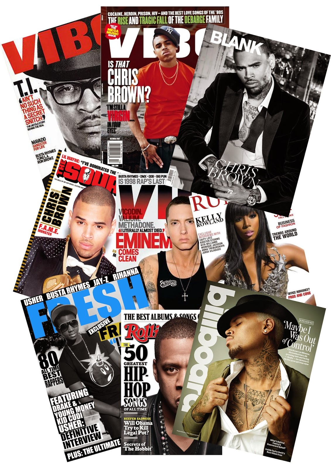
Music Magazines
I have made a collage of R&B music magazines. The magazines in this collage that I have included are Vibe, Billboard, Runway, Fresh, The Source and Rolling Stones.
The reason I have decided to do an R&B magazine is because my favourite musician is Chris Brown and most of his music is R&B therefore doing an R&B magazine will be best as that is the genre of music I listen to the most and I will have a better understanding of.
All the magazines include R&B artists as the main image therefore so will mine. The majority of the magazines are red, black and white therefore I may decide to do mine them colours to follow an R&B music magazine or I may decide to do them different colours so mine can be a unique R&B magazine.
When making my music magazine, the artist on the cover of my magazine may be Chris Brown as he is the reason I have decided to do an R&B magazine and he is also a popular artist. Having a popular artist on the cover of the magazine is important for the music magazine to sell. However, if I do decide to do my own photography for higher marks then I will use Chris Brown as part of my inspiration for how the male on the cover needs to look.
Most of the fonts on the music magazine covers are very similar therefore I will most likely also be using similar fonts to the magazines. However, I will experiment with different range of fonts first, before I decide whether or not I want to use similar fonts to the magazines above.
Subscribe to:
Posts (Atom)